Week 12: Final Week

Design

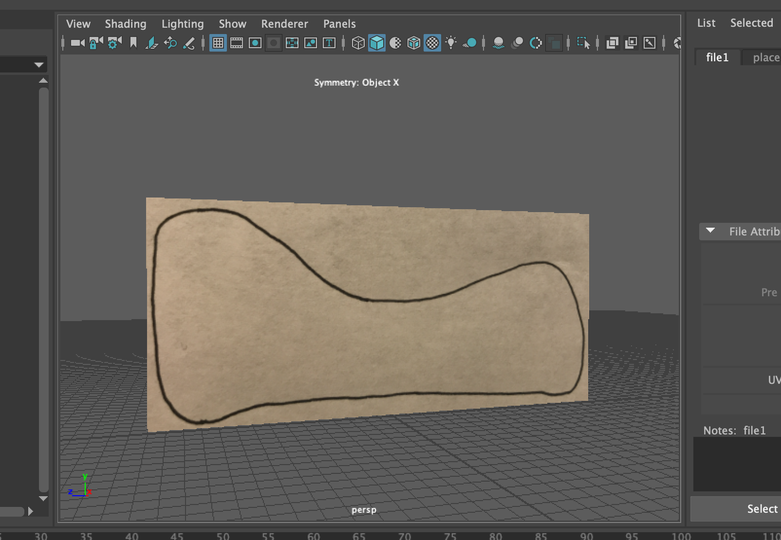
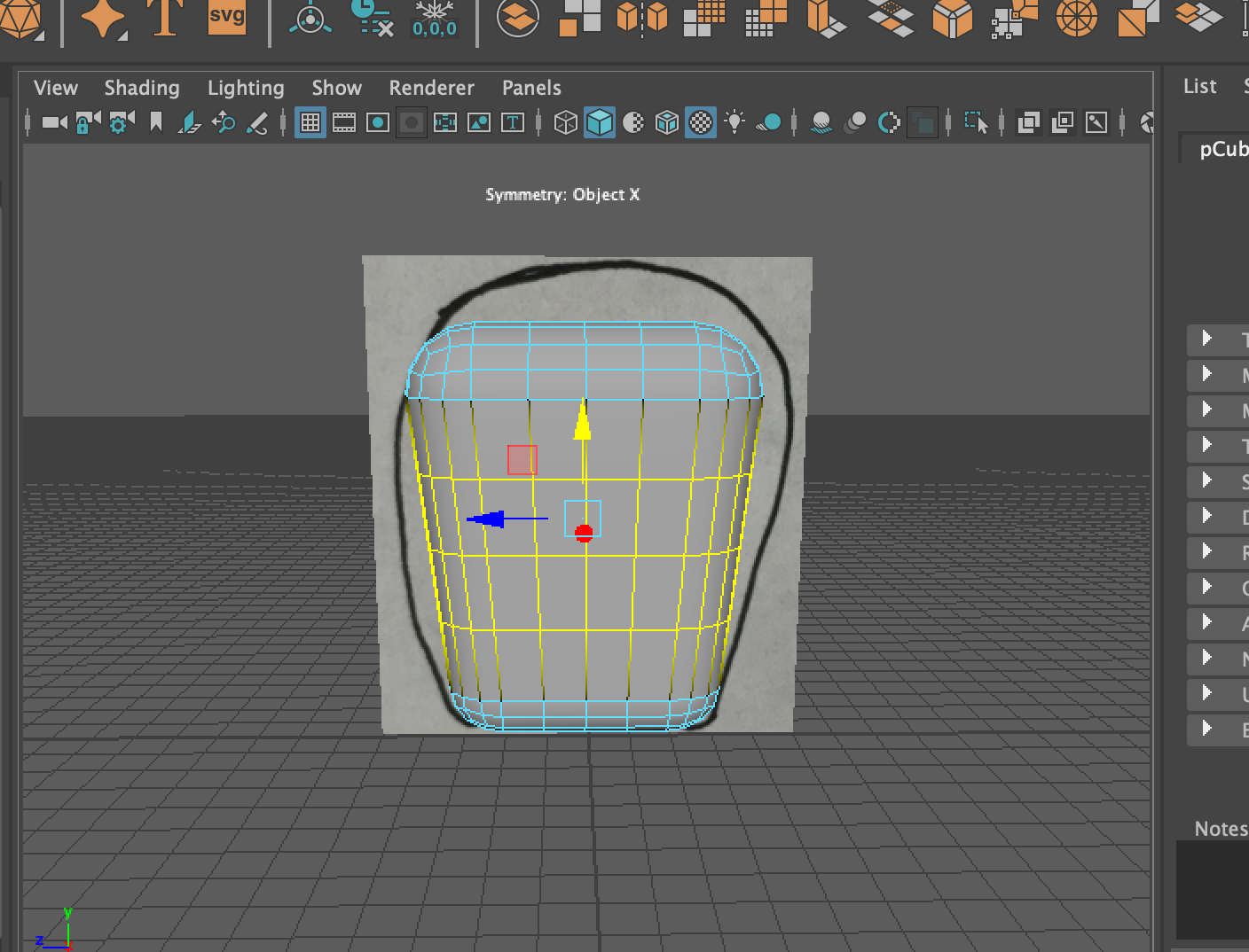
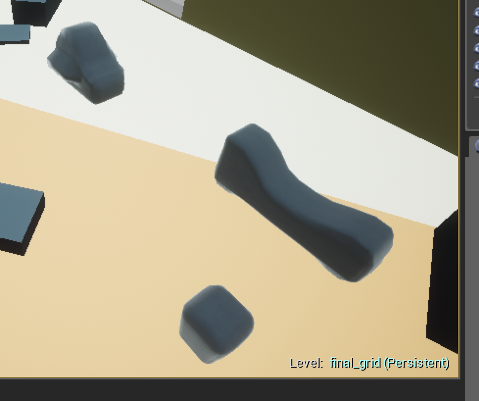
First, to turn give my area more of a room feeling, I began by modeling a bit of an abstracted/surreal version of waiting room furniture in Maya:

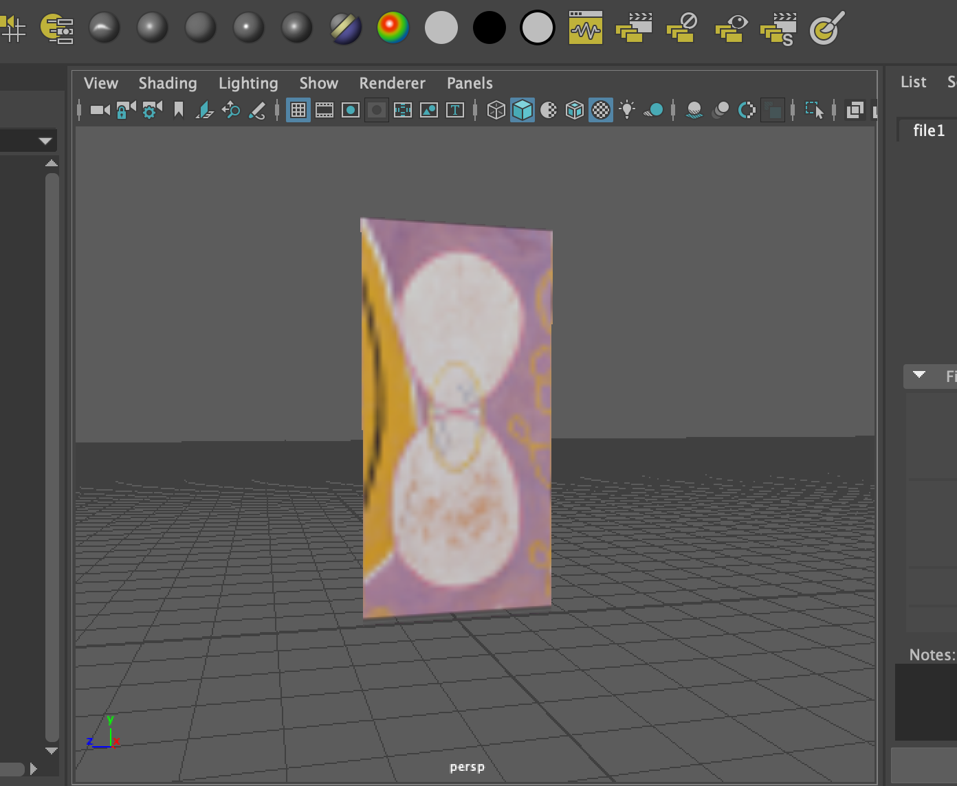
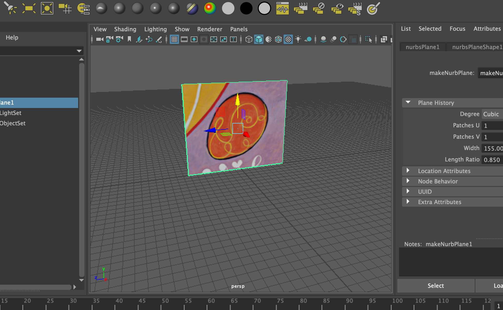
I also made a fuzzy texture based on some tutorials I found online and used the car material set to find some other materials. I also made a custom material for the walls and floors based on the tutorial Jonathan shared with us. Then I placed the colored balls in the scene in order to see what they looked like together and in contrast to the room. I had some trouble with the lighting initially, but Jonathan showed me how to turn on the “bloom” setting in order to get the emissive material for the florescent lights to activate and how to use spotlights to achieve the lighting effect I was looking for.

Screenshot 2019-04-21 13.36.14.png

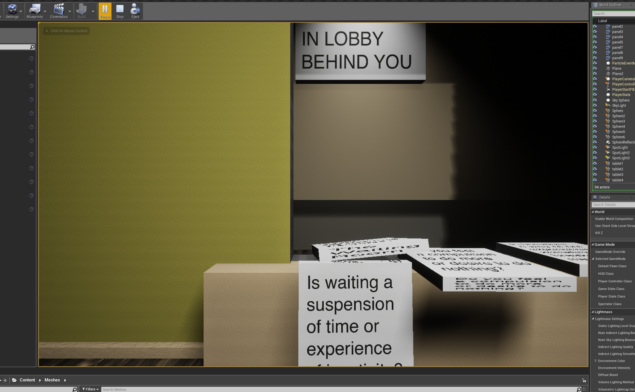
I also added signs based on quotes from a radio program I listed to on boredom that another professor shared with me. I wanted to include them in order to frame the experience for the user and prompt them to think about waiting, the narrative we tell ourselves about our lives and what we think we value. I had originally wanted these to be implicit in the piece and to not overtly say them, but I think that VR is such a new medium that I wanted to help people engage with it critically.

I also came up with a narrative around the piece. After listening to the podcast, I began to imagine a future where waiting is essentially eliminated for elite members of society - basically an extreme extension of the current trends we see today with automation, personalized experiences with AI and stimulation from devices. I imagined that in this extreme scenario people started making underground waiting experiences in order to get into the “default network” brain state or have a down time when they are doing “nothing.” I imagined that this piece was being shown in a museum 100 years later and created a brochure for the exhibit (see next post).

Week 11: Final Project Progress

TECHNICAL DESIGN

The past couple weeks I have been experimenting with way to make my waiting experience and trying different technical approaches to achieve this.

My first experiment was learning how to make objects move along a spline automatically to simulate the autonomous robots. I followed a tutorial I found online and was able to make a few different configurations. I found out that the objects moving on the spline can push physics objects:

Screenshot 2019-04-04 13.30.34.png

I also practiced trigger boxes:

Next, I learned how to make a procedurally generated grid of objects and change their spacing, rotation and introduce randomness into these parameters:

Screenshot 2019-04-09 12.45.43.png
Screenshot 2019-04-09 13.07.01.png
Screenshot 2019-04-09 14.27.26.png
Screenshot 2019-04-09 14.33.07.png

I also did the tutorials to connect blueprints in order to learn how to bring all of these elements together.

Finally, I tried making objects destructible because I was thinking of having the object that is built be destroyed in the end and wanted to explore different ways of achieving that:

VISUAL DESIGN

To make my project more concrete, I came up with a visual language and setting to model it off of. I decided to base my waiting experience on a doctor’s office waiting room and have the interaction simulate the wooden bead game for kids. I am going to try to abstract these experiences, but I hope that because the colors and shapes will be familiar, they will subconsciously evoke experiences of waiting for people.

waiting_moodboard.png
waitingsystem_moodboard.png

From these images, I came up with the below palette:

waiting_background_rgb.png
waiting_beads_bright_rgb.png

Next, I started mocking up my abstract waiting room based on this inspiration:

Screenshot 2019-04-16 10.38.13.png
Screenshot 2019-04-16 10.48.10.png
Screenshot 2019-04-16 10.38.22.png
Screenshot 2019-04-16 10.48.23.png

I like the tension between the bright beads and the drab room, but one thing I was concerned about was being able to see where the balls are going. Jonathan said that this would be easier to perceive in VR. I tested it and found this to be true.

I also talked with Jonathan about making the space smaller and working on adding texture before worrying too much about making the interaction. This will be my focus for the next few days and then I will turn to the interaction!

Week 7: Final Project Research

For my simulated final project I have selected the theme of waiting. This past week I dug into doing some research on waiting. I looked into psychology of slowing down and boredom, the psychology of waiting in lines,  waiting design (formally known as service design) and waiting narratives. I also brainstormed different types of waiting and categorized them by type. Here are some summaries from my findings.

linewaiting1.jpg
linewaiting2.jpg
Waiting for Godot

Waiting for Godot

Boredom/Slowing down

Default mode network - our brain when we are “bored”

“It is during these times that we might be daydreaming, recalling memories, envisioning the future, monitoring the environment, thinking about the intentions of others, and so on--all things that we often do when we find ourselves just "thinking" without any explicit goal of thinking in mind.”

In her TED Talk, podcaster Manouch Zomorodi talks about how learning about this inspired her to write a book about our relationship with devices and why default mode is important:

So our body, it goes on autopilot while we're folding the laundry or we're walking to work, but actually that is when our brain gets really busy. Here's boredom researcher Dr. Sandi Mann: ‘Once you start daydreaming and allow your mind to really wander, you start thinking a little bit beyond the conscious, a little bit into the subconscious, which allows sort of different connections to take place. It's really awesome, actually.’


In this “default mode” a few things happen according to Zomorodi:

  • we connect disparate ideas

  • solve some of our most nagging problems

  • do "autobiographical planning”, looking back on our lives, taking note of big moments, create a personal narrative and set goals and figure out steps to reach them

There is still a lot about it that isn’t well understood, but with constant stimulation from devices, this is happening less frequently for the average person.

Other related ted talks:

linewaiting3.png

Psychology of waiting in lines

NYTimes - Why Waiting is Torture

  • “This story hints at a general principle: the experience of waiting, whether for luggage or groceries, is defined only partly by the objective length of the wait.”

  • “Occupied time (walking to baggage claim) feels shorter than unoccupied time (standing at the carousel).”

  • Research on queuing has shown that, on average, people overestimate how long they’ve waited in a line by about 36 percent.

  • Mirrors are next to elevators so that people have something to pass the time with

  • For the same reason, supermarkets have impulse buy items

  • Uncertainty magnifies the stress of waiting

  • Feedback on waiting experience can make it better

  • Experiences of waiting strongly influenced by final moments

  • “Slips and skips” in line - demand for fairness

  • Lines are a social system

  • Choosing lines - people focus on the line they’re “losing” to instead of the one they are beating

  • Fairness also dictates that the length of a line should be commensurate with the value of the product or service for which we’re waiting.

linewaiting7.jpeg

More on The Psychology of Waiting in Lines

  • People want to get started

  • Anxiety makes waits seem longer

  • Uncertain waits are longer than known, finite waits

  • Unexplained waits are longer than explained waits (same idea as feedback)

  • Unfair waits are longer than equitable waits

  • Solo waits feel longer than group waits


Service Design/Queueing theory

There is a whole science around making people wait in lines! Everyone points to Disney as the master fo this.

linewaiting8.png

More Psychology of Waiting

  • 8 principles

    • Emotions dominate

    • Eliminate Confusion

    • The Wait must be appropriate

    • Set expectations

    • Keep people occupied

    • Be Fair

    • End Strong, Start Strong

    • Memory of an event is more important than the experience

  • Design Implication: Make the surrounds bright and cheery, attractive and inviting.

More resources on queueing theory

servicedesign1.jpg

Art About Waiting

I also revisited one of my favorite plays, Waiting for Godot, to understand what makes the play so compelling. The whole plot is people waiting together (for Godot) and the whole time it’s unclear who Godot is or why they are waiting for him or when he will come. I found the below diagram that explains really concisely the emotional arc that makes the play work:

godot_plot.png

Waiting Experiences

For something to start - anticipation:

  • Movie

  • Summer

  • For someone to come back

  • Pot to boil

  • Cookies to be done

  • Internet dial-up

  • Tape to rewind

For something to change:

  • Delay on an airplane

  • Delay on the subway

  • Stoplight to turn green

  • Someone to leave

  • Ice to freeze/Ice to melt

For something to arrive:

  • Subway platform

  • Bus stop

  • Santa

  • Letter

  • Phone call

  • For a friend

  • Takeout delivery

  • Food at restaurant

  • Coffee order

  • Elevator

  • Email

  • Text

In line:

  • Post office

  • Grocery Store

  • Airport

  • Drive through

  • DMV

  • Voting

  • Doctor’s office

For something to pass by:

  • Cars when crossing the street

  • On the sidewalk: birds, dogs, bikers, joggers

  • Parade

  • Race


And finally, from Phantom Thread:

Reynolds: “Waiting for what?”Alma: “For you to leave me”

Reynolds: “Waiting for what?”

Alma: “For you to leave me”

Week 5: Labyrinth Final Touches

This week we prepared to give our final labyrinth presentations by finishing the details of our labyrinth and documenting them.

Finishing the Shapes

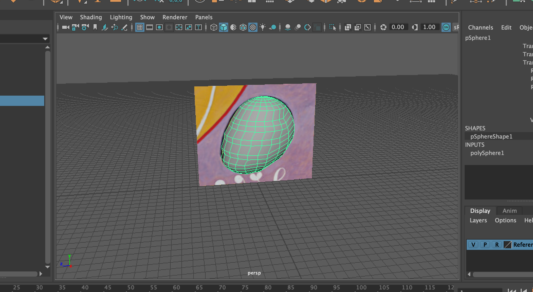
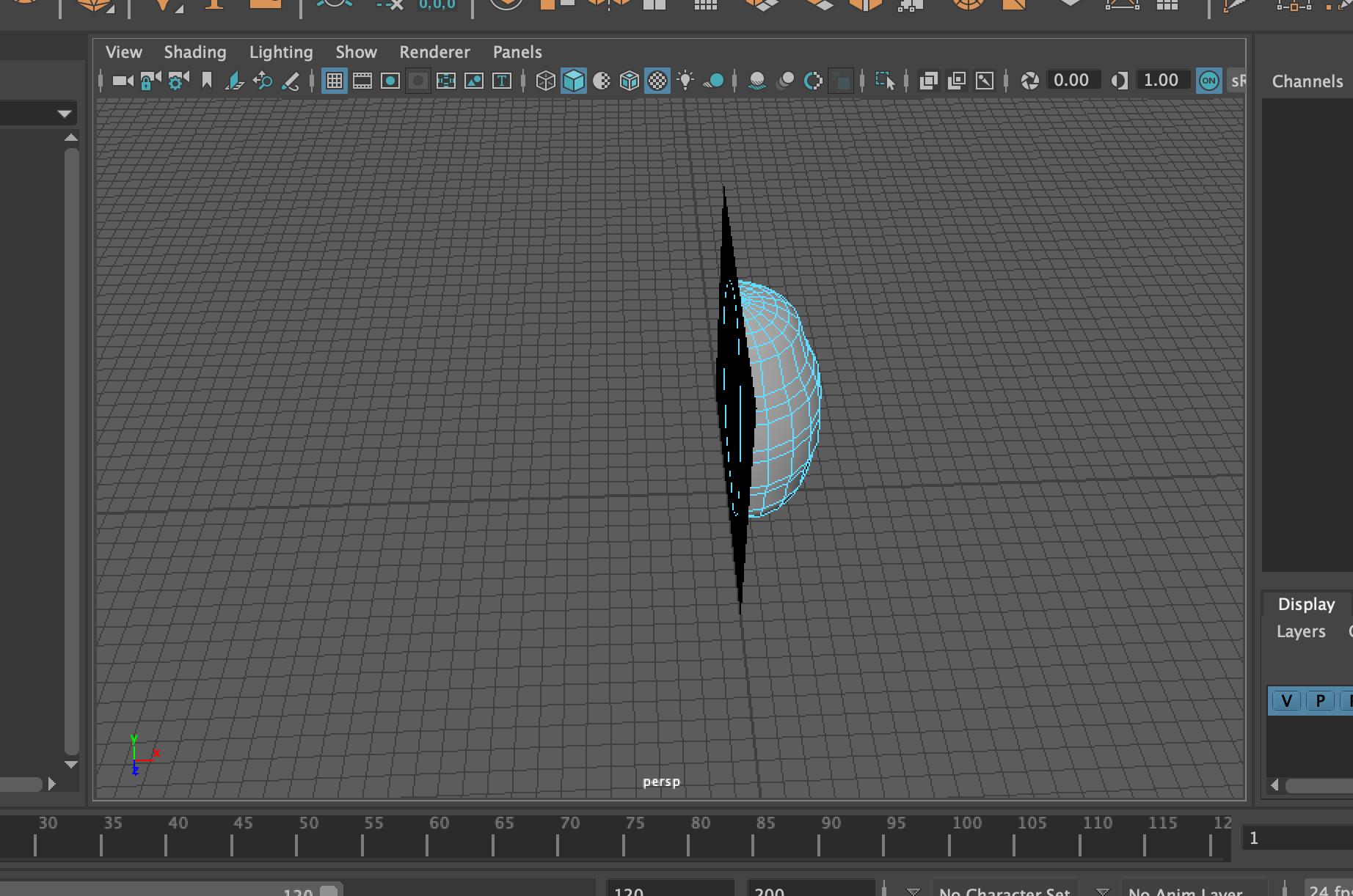
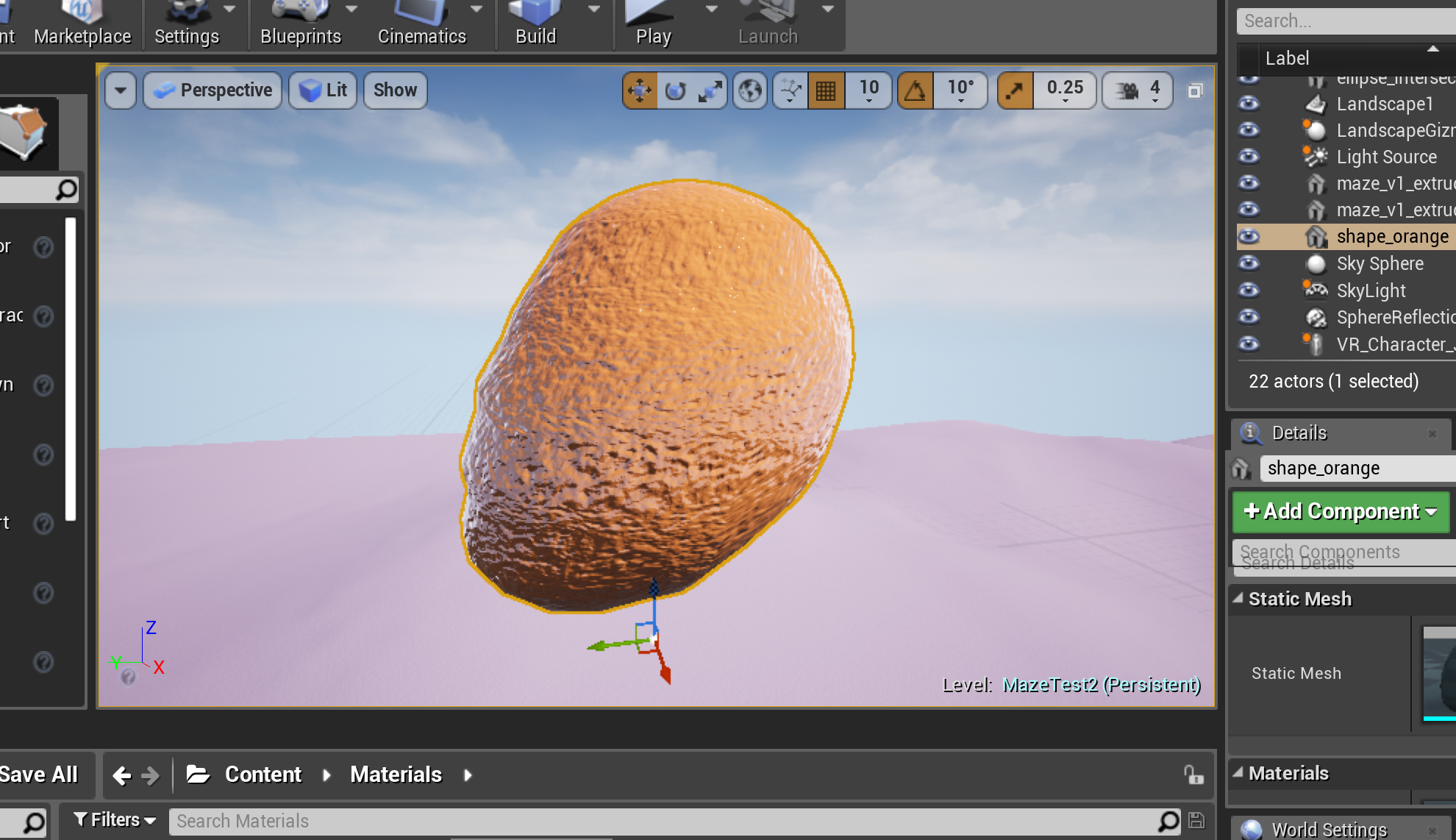
In Maya, I made a few more shapes so that I had four total. These ones were a little more complicated and on one of them I didn’t completely connect the vertices (I couldn’t tell in Maya) so when I imported it into Unreal it looked weird. I unfortunately ran out of time to re-do that shape.

All of them together

All of them together

My failure shape!

My failure shape!

Adding to the Landscape

I added a ring of mountains around my maze using the same techniques I had previously used. However, this seemed to make the file too heavy for my computer to run, so I had to develop on the ER and VR station laptops (which had some Unreal version problems…)

Then I added the shapes to the landscape. At first I had them densely clustered, but the decided to mimic the layout of the af Klint painting to make them more balanced and encourage the viewer to really take in each one.

Screenshot 2019-03-06 10.07.59.png
Screenshot 2019-03-06 09.56.09.png


Testing in VR

I tried to test my project in VR, but I couldn’t get SteamVR to work on the VIVE station. I talked to Marlon and he is going to try to fix the station, but wasn’t able to do so in time for class. I have learned that dealing with these sorts of issues are a big part of working and developing in VR!

Week 4: Labyrinth Environment

Landscaping

This week I worked on making my labyrinth environment more cohesive. Hannah showed me how to make landscapes, so I started by building up the ground to create walls. I first started by keeping all of the elements where they were. When I went into first person play mode, I realized that everything felt too cramped and I need to scale the whole thing up. I deleted all of the meshes and decided to start over placing them in the environment:

Screenshot 2019-02-23 17.11.17.png

I made the walls so that when you start, the wall on the right starts out high and becomes lower in height throughout the maze. The wall on the left starts low and by the end is very high. I am interested to see when people notice this change and how it makes them feel.

After getting the walls to have the appearance I wanted (I also tried out the smoothing and Perlin Noise tools), I moved onto the rest of the appearance.

I had decided to use the af Klint paintings as a reference, so I decided to take the colors from there. In illustrator, I took colors from one of her paintings to create a palette for my VR experience:

palette_main.png
palette_highlights.png

Then I put these colors onto some objects in Unreal to see what they would look like all together. To me, these colors look different in Unreal even though I’m using the same HEX code (maybe it’s the shininess?) so I’m wondering how people get color matching or how they make palettes for their projects. I tried both types of HEX color settings:

Screenshot 2019-02-23 18.48.00.png
Screenshot 2019-02-23 18.51.46.png

I also tried spacing the meshes out around the labyrinth and going into play mode to see what the colors looked like from that perspective.

Screenshot 2019-02-23 19.02.37.png
Screenshot 2019-02-23 19.02.28.png
Original painting

Original painting

Modeling

I also knew that I wanted to do more of my own modeling in Maya. I had been using primitive shapes, but I wanted to learn more about how to modify them myself, which would be especially important for trying to replicate the shapes in the painting.

I watched some tutorials on Lynda.com and then selected a few shapes from the painting I wanted to model:

Shape selections

Shape selections

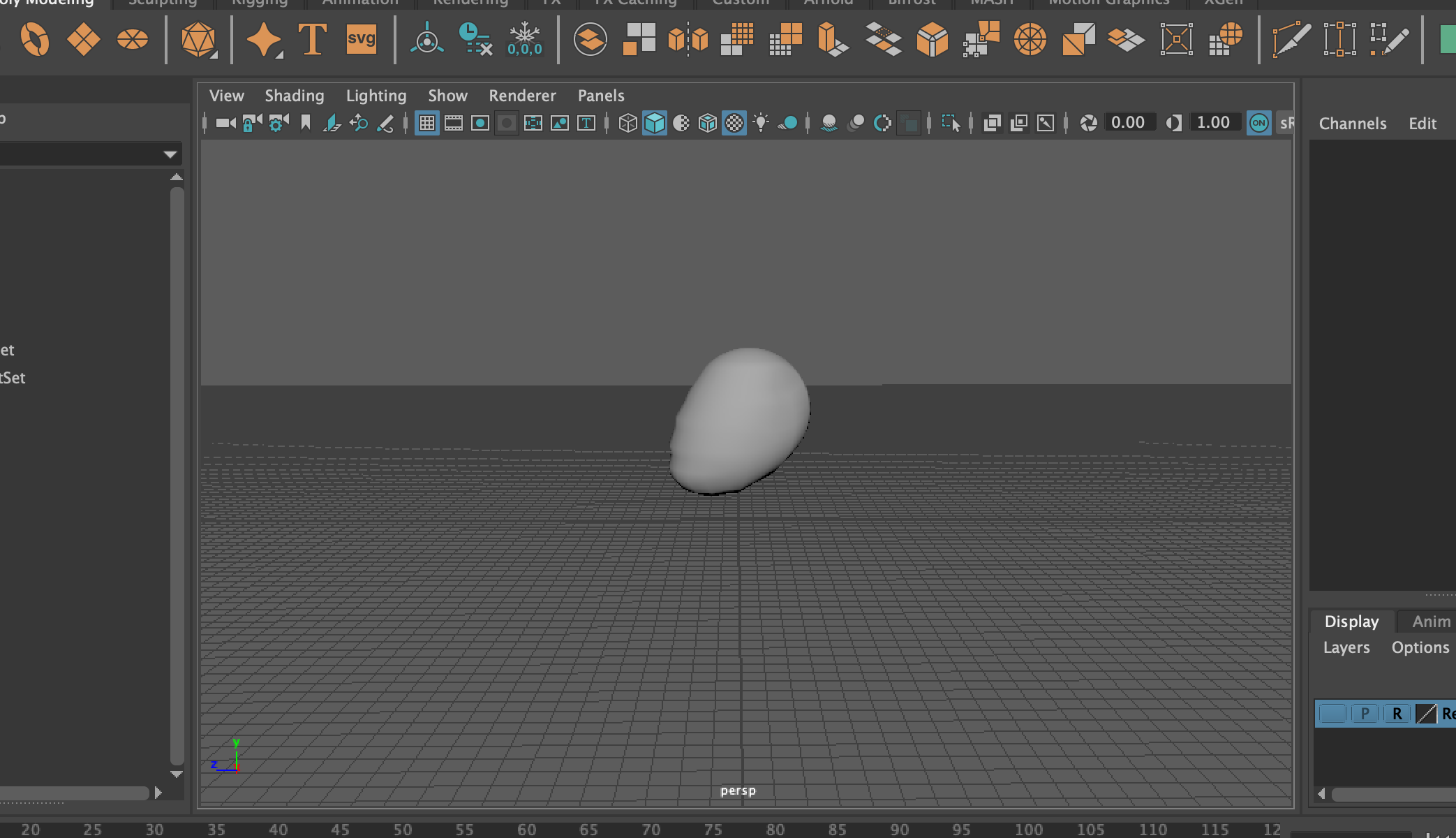
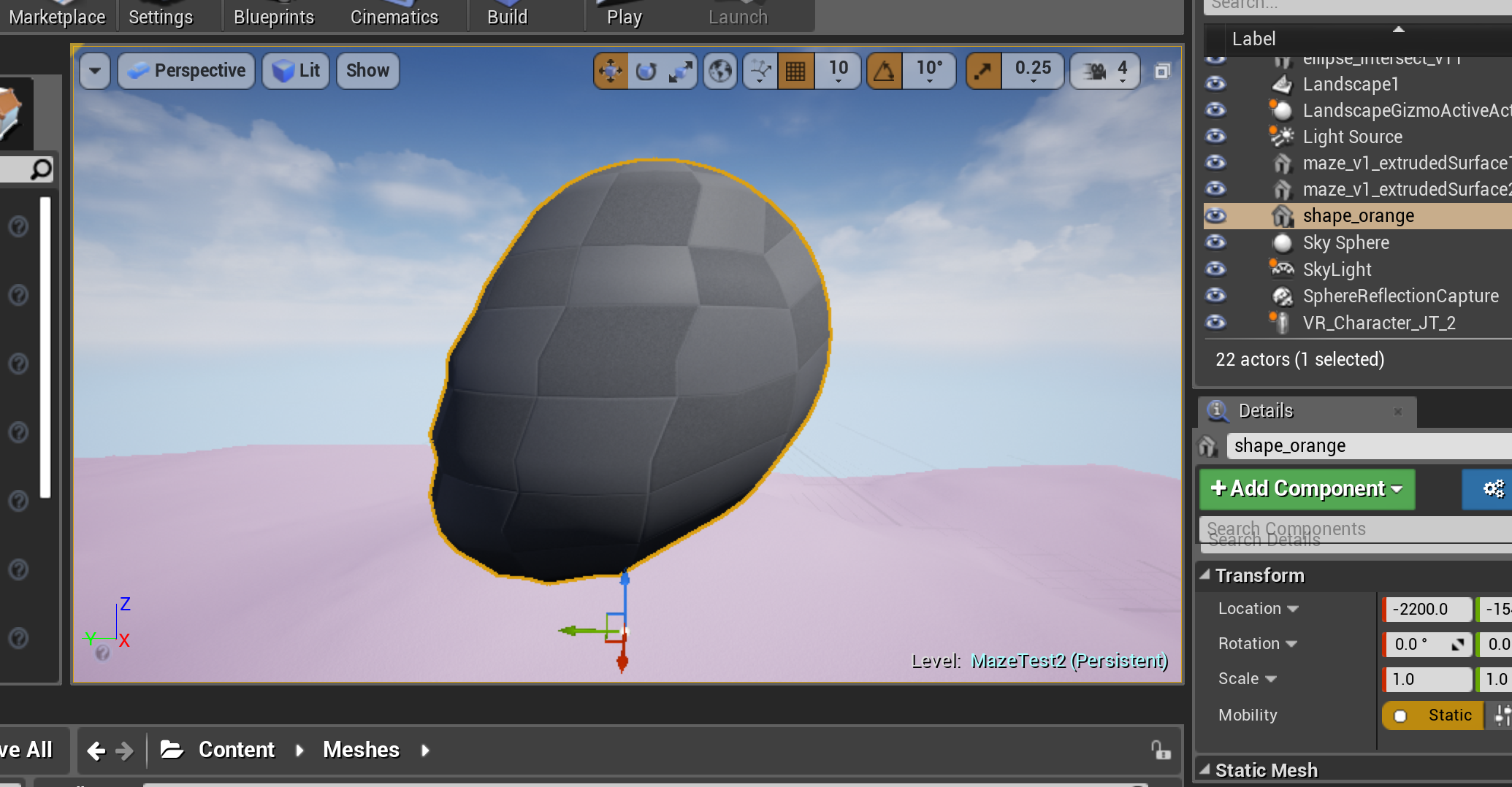
I followed the steps I had learned in the tutorial and made my first blob:

I placed it in the environment in a couple different sizes. I love how it turned out! I’d like to add some more patterns to its surface so will look that up next. Unfortunately this is the only shape I got to this week, so I will finish the other for next week.

Going In

Hannah and I worked together to test our projects in VR. After having a version issue with Unreal, we were able to launch it on the VIVE. We weren’t able to move around because we couldn’t get the controller to teleport, but I really enjoyed seeing my project in VR. I loved seeing close up the textures of the materials I had made for the ground and floating blobs.

IMG_5287.jpg
IMG_5289.jpg

Here is a screen recording of Hannah and another classmate exploring my labyrinth in VR.

Week 3: Labyrinth Details

This week we continued building our labyrinths:

Given the timeline and my beginner skills in Maya and I decided to keep the elements of changing time through scale but draw more heavily on the abstract references from Hilma af Kint (rather than trying to do a lot of detail in an urban landscape). A lot of her work focuses on dualities and especially the meeting of dualities. I am thinking I could incorporate this metaphor by having each wall be opposites of the other, so that you are walking between dualities or having the maze environment switch half way through so that you are crossing dualities.

I made a few mood boards to capture some of the shapes, colors and feelings I wanted to achieve:

Colors

Colors

Shapes

Shapes

Space/Environment

Space/Environment

I also sketched out some of these ideas in scene form to help visualize them.

I also sketched out some of these ideas in scene form to help visualize them.

I would like to achieve the following:

Design/Environment

  1. Muted colors

    1. Purple

    2. Red

    3. Yellow

    4. Green

    5. Blue

    6. White

    7. Black

    8. Pink

    9. Orange

  2. Intersecting ellipses

  3. Organic shapes/colors

  4. Organic Movement

With this in mind, I got to work translating this to my labyrinth.

Themes

  1. Time represented by blooming (of “flowers”)/change

  2. Duality represented by placement

Choose 3 shapes to start

  1. Spirals

  2. Intersecting ellipses

  3. Organic fan

This looks terrible!

This looks terrible!

First, I experimented with taking shapes directly from some of Hilma af Kint’s paintings using Illustrator, extruding them in Maya and then importing them into Unreal. They looked fine in Maya but did not translate well to Unreal, so I abandoned this method.

Ok, this is working better

Ok, this is working better


Instead, I tried putting together and manipulating primitive shapes in Maya and then importing them into Unreal and this worked. I made three shapes in Maya based off of Hilma af Kint’s paintings: a spiral, two intersecting circles, and three intersecting ellipses that looked like petals.


Then I imported these into Unreal and positioned them around my labyrinth to make up the walls. I then played around with changing the size of the shapes so that they transition from being very large to very small and vice versa. Overall, I think it looks to uniform and cluttered right now - I want it to look more free-form and abstract. I’m not sure that the “flower” shape fits, so I may take it out.

Screenshot 2019-02-21 00.37.19.png

I decided to leave the design for the moment and experiment with materials to see if that would help me see a different perspective.

I followed the tutorial and use the preset “Moss” material as a base. I made some of the floating balls pink and the ground green. I loved making these materials and playing around with the texture and color - I’m excited to do more!

Screenshot 2019-02-21 10.51.51.png
Screenshot 2019-02-21 11.20.38.png
Screenshot 2019-02-21 11.48.25.png
IMG_8116.jpg

Week 2: Labyrinth Foundation

After seeing the Ureal and Maya demo in class, I have a better understanding of what is possible when starting out. I have come up with a fourth, more concrete idea that brings in elements from my previous three ideas.

I am thinking of making a labyrinth that starts with high walls that deteriorate as the labyrinth continues, to the extent that they are reduced to pebbles at the end. At first, I wanted to add in other changing element such as plants that either become overgrown or die as the maze continues. I wanted to position these in such a way so that if you entered the labyrinth from the other side it would have the opposition effect - it would appear as though the walls were being built and the plants were growing/blooming or being cultivated. Logistically, I was thinking I could put the plants in little nooks so that you see different plants from different directions. With this idea I would get to bring in elements from my three ideas above: 1) changes in scale 2) suggestion of the passage of time and 3) dualities.

I started working on this in Unreal and Maya following the tutorial our professor made for us. First, I used illustrator to outline my maze design and then imported it into Maya where I rotated and extruded it. I used one of the demo people to make sure it was the height I wanted.

IMG_8136.jpg
walls_maya.png

I also fixed the UV pattern so that it was uniform. I ran into a roadblock here when I the UV pattern didn’t show up even though it was working in the UV menu. I talked to my professor Jonathan about it and it turned out it was a view setting on the display! This has been what has been most challenging about this software so far - I don’t know what any of the buttons do or what any of the possibilities even are or what to google to fix it!

uvmapping2.png

Next, I made a new level in Unreal, imported my maze into Unreal and re-sized it.

first person.png
walls unreal.png
Animated GIF-downsized_large (1).gif

I placed my first person character in the maze and practiced walking around to see how it might feel in VR.

BTW - I hate that the gun is the default!

With learning the ins and outs of this new software, this was as far as I got this week!


Week 1: Labyrinth Concept

Our assignment this week was to start thinking about our first assignment: a labyrinth.

maze (9).png

We had to first choose a maze design from a maze generator called maze5 (limited to 4 rows and columns) and then come up with three concepts around that pattern.

I chose the maze to the right. I like that it is an organic form but angular at the same time. Beekeeping also runs in my family so I have a personal connection to the form and have always wanted to incorporate this into projects.

In terms of the experience and more detailed form, I had three main ideas:

1. Journey through history/time: Journey of a “spime” or specific location through past or future history. Such as a glacier melting or a street landscape changing over time.
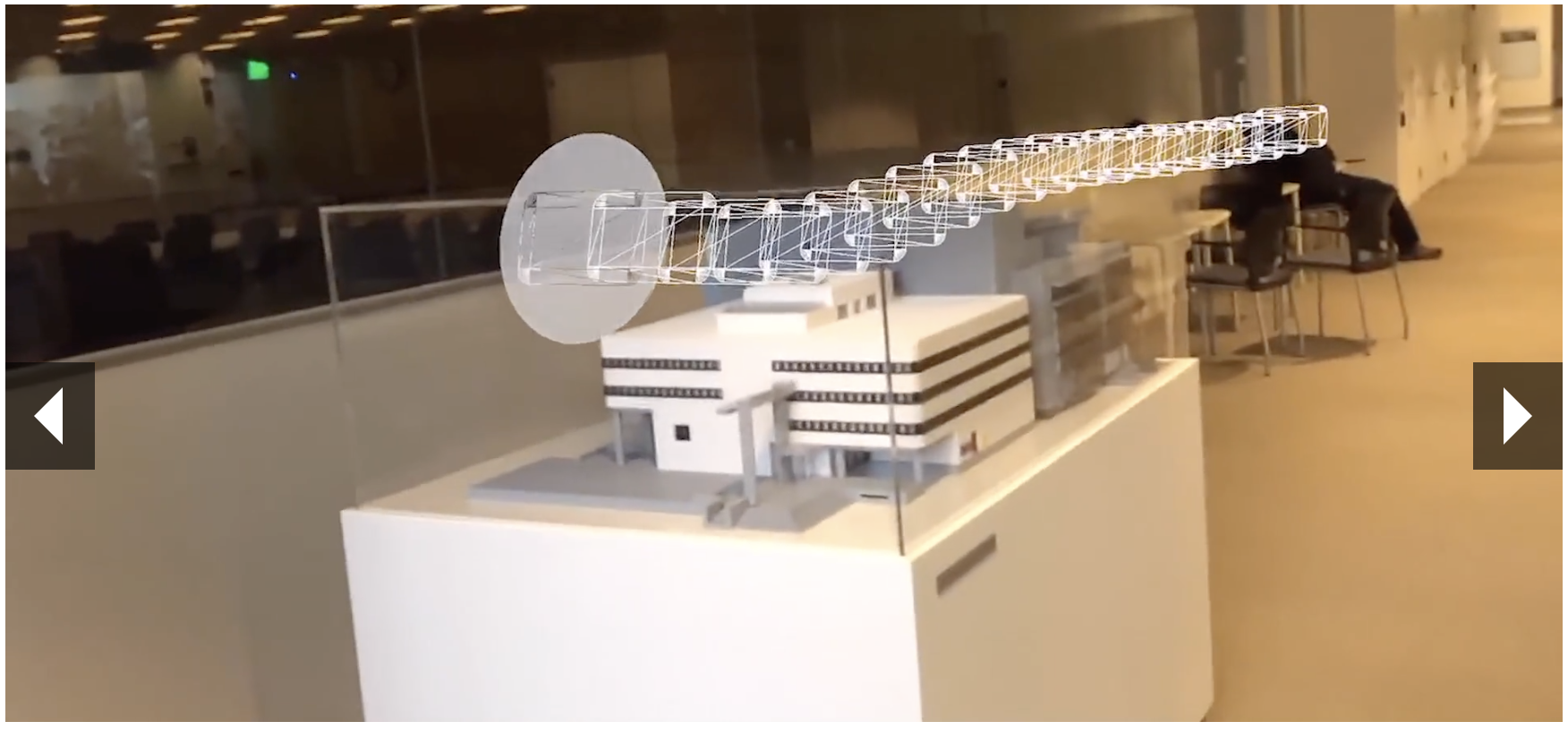
This image is from a project at the MIT Reality Virtually Hackathon in which you can “walk” through stills of a video. More here: https://devpost.com/software/continuum-dy1av0

This image is from a project at the MIT Reality Virtually Hackathon in which you can “walk” through stills of a video. More here: https://devpost.com/software/continuum-dy1av0

This is a before and after in a neighborhood in Chicago. More here: https://www.dnainfo.com/chicago/20150803/logan-square/logan-squares-milwaukee-avenue-then-now-photos/

This is a before and after in a neighborhood in Chicago. More here: https://www.dnainfo.com/chicago/20150803/logan-square/logan-squares-milwaukee-avenue-then-now-photos/

2. Scale, size perspective: I love tall buildings and huge trees and big mountains and the feeling of awe that comes from these - a labyrinth that evokes this feeling by using different scales and perspectives or that you’re not sure if you’re big or small.

I took this photo of the Brooklyn Bridge in southern Manhattan.

I took this photo of the Brooklyn Bridge in southern Manhattan.

3. Duality, border, topology: journey between or on the edge of some sort of border between two entities. I like the idea of making the “walls” penetrable so someone could actually step through if they wanted.

I took this photo of the Moray Ruins in Peru. This was a laboratory the Incans used to learn about how plants best grew in different conditions and altitudes. There is a lot of duality symbolism in Incan art, stories and architecture and I felt it r…

I took this photo of the Moray Ruins in Peru. This was a laboratory the Incans used to learn about how plants best grew in different conditions and altitudes. There is a lot of duality symbolism in Incan art, stories and architecture and I felt it reflected in the landscape there.

We also had to put together other visual references for these ideas. Overall, I like the idea of contrasting colors, stark shadows and an organic feel. These photos are a mix of pictures I took in Peru and at the Hilma af Klint exhibit at the Guggenheim.

IMG_7307.jpg